This article is meant to be used as a template for understanding the process, costs and challenges of making prints that match other artworks as perfectly as possible. This is not always the case: sometimes a perfect match is not required (technically or aesthetically) – but the workflow is still essentially the same. Lets start by going through the steps, and then sketch out potential costs with a sample project.
Step 1. Making a scan
Step 2. Deciding on the proper medium for the reproduction print
Step 3. Iteratively color matching smaller proof prints to the original
Step 4. Making a final print
As an exercise, lets price out a sample repro project.
Lets say your original is an oil painting on canvas, measuring 36×48″. You would like to produce a smaller 24×36″ print on paper, potentially launching a whole edition of these prints.
Your scan, considering the dimensions, should be a $100.00 high-res scan. Proofing and color matching oil paintings can take 4-6 rounds of proofs – that’s $25.oo per proof, so the total for this step would be $150.00 at the most. The final print, at 24×36″ with some generous 3″ borders, printed on a premium cotton rag paper, would cost you approx. $155.00 – bringing the whole project to $405.00, plus taxes.
Is that a lot? Maybe, depending on many different factors: what is the price range your works normally sell at; how you position your print prices vs. pricing your original paintings, or whether it’s a one-off or a larger edition set. Because $250.00 out of that $405.00 is a one-time expense – meaning you only have to do it once, all consecutive prints just cost $155.00 each. So if your edition is set to 10 prints plus 2 APs, that’s only $180.00 per print which suddenly seems a lot more reasonable.
Getting into minute details…
The wall-of-text section below takes a deeper dive into more esoteric issues related to color matching and color work in general, please feel free to skip! On the other hand understanding these issues might help you with planning your other projects, so we’ll just leave this here. Enjoy!
Deconstructing step 1: making a competent scan of original artwork.
This is obviously a foundational part of the project; and you can read about our fine art scanning here. Although our scans are as accurate as we can get with the currently available tech, the reality of the situation is that certain types of art are difficult to record well, due to inherent physical limitations.
As an example: within the digital domain, the brightest possible color is pure white (RGB values of 255/255/255). What follows is that the pure Red, for example (RGB values of 255/0/0) becomes intrinsically less luminous than just blank white – which can be a complete reversal of what’s happening within the actual physical artwork, where pigments can easily be punchier and brighter than the base. So already we see some pretty dramatic deviations from how the the original painting presents, and there’s more to come…
To address the sum total of these issues we need to proceed to the next step.
Deconstructing step 2: Making proofs and comparing them to original art, followed by corrections and more proofs.
When we first put up a scan on a screen and look at the actual artwork sitting on a viewing table nearby, the two seem to match pretty well. Then we make a proof print, set it next to original and… experience a massive disappointment. They don’t match! They don’t match at all! What happened? Contrast is off, certain colors shifted hue, there seems to be a cast… This looks nothing like the original!
Well, hello and welcome to the world of color matching. Reasons why things don’t match on the first try are many, and discussing them in detail goes way outside of the scope of this article, but the most common reasons are as follows:
– inherent, foundational differences between how color is represented (and experienced) in a digital space and in RealLife(tm).
– pigment metamerism: situations where the same pigment looks different under different light sources (and scans differently too). Certain colors are notoriously bad in that regard, Phthalo Blue being one of the worst offenders here, and there are more.
– printer gamut issues: certain color ranges are just not possible with certain inks/paper combinations. Lets say the original artwork features bright yellow part right next to a bright green patch. They relate to each other in a very specific and exact way. Now we look at the print sample – the yellow seems to come across pretty accurate, but the bright green is physically unachievable with the inks the printer use, so it’s a duller, less saturated version in the print. The relationship between the yellow and green is now broken, and since the green is already maxed out, it’s the yellow that needs adjustments to get back to a color relationship we want, which is somewhat counterintuitive.
– simultaneous contrast issues: the above example mentions yellow and green next to each other. The relationship between two colors is based on both sides affecting each other – yellow makes neighboring green appear cooler than it would have been on its own, and green makes yellow look more magenta than it really is out of the tube. Except the computer (or rather the color management system) does not understand subtleties like this and translates the colors without any consideration for relations like the above..
Long story short, we just need to buckle down and keep on making adjustments and printing proofs until the reproduction starts looking right. It’s an iterative process – starting with big, global changes, then slowly moving on to less obvious, and finally zooming in on specific color patches.
Color matching and proofing is a single largest effort- and time-sink in all of repro-printmaking. It takes close to a day for a proof to dry and for inks to fully cure before the colors stop shifting. Then we have to compare the proof to original (we prefer to color match under the daylight exclusively – it’s just better all around), take notes and implement changes to the digital image, then do it all over again, iteratively, until it’s done.
In theory, if we were only working with originals all painted with the same exact brand of oils, and printing only on one specific type of paper with the same exact inks, it would have been possible to create an accurate “translation table” that would work one the first try. In reality it’s quite a bit different, so we just have to do it hard way – although we do have established matching routines for working with watercolors, oils, charcoal/pastels and other media types.
Another difficult aspect of proofing/matching is that we usually work on a smaller scale to save your money. The proof prints are usually quite a bit smaller than the final reproduction print – otherwise the color matching expenses are going to be completely astronomical… Then comes the time when we need to make a large print, hoping that the scale change is not going to shift the perceived color too much.. but it usually does and we’ll have to print yet another full-sizes copy.
In practice it takes 2-4 rounds of proofs to get a good match with watercolor drawings – that’s because watercolor pigments are the closest to the type of pigments used in printing inks, and watercolors work from white being the brightest color, just like digital images.
It can take 4-6 proofing rounds to match an oil painting, and even more for acrylics. Ironically it’s easier to match up very colorful pieces rather than something nearly monochromatic, such as charcoal or graphite drawing.
Some of the most complex and important pieces I’ve done during my many decades in this profession involved making over a dozen of proofing rounds. But the results are usually worth it – as long as you can afford the bill.
Step 3. is the simplest of them all – just making a final print!
It needs to be mentioned that all of the challenges and expenses of color matching are easy to justify when we are producing a whole edition of reproduction prints at once: even though it’s expensive, still it is a one-time expense, and once this expense is spread across the whole edition set it often becomes negligible; but for the single pieces this can be a real high entry barrier.
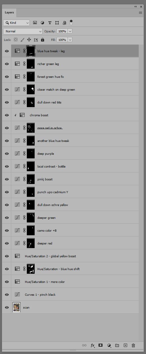
Finally – just to illustrate the above concepts, you can see below a screen capture of a Photoshop’s Layers palette – showing all the adjustments that were needed to bring the print into closer match with the original artwork. It took 6 printed proof copies to get the match done right.